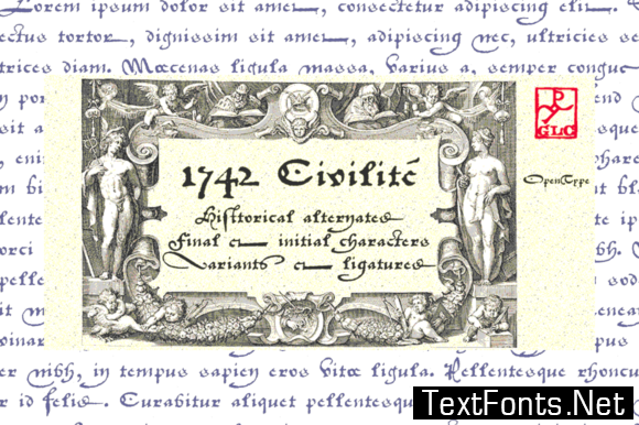
In the late medieval period appeared a “semi-cursive” writing, the French “écriture de civilité”. Quickly, it was carved and melted down in lead for printing.
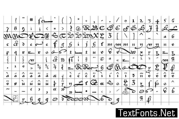
It is a very elegant running font, with numerous variants, both final than initial characters, many of the accented small characters were present in the model. We was inspired from “Fournier Le jeune “, in his catalogue named “Modèles des caractères de l’imprimerie … gravés par Simon-Pierre Fournier le jeune” published in 1742 in Paris.
This font supports as easily enlargement than small size, remaining elegant and pretty.


