The inspiration comes from some old documents and store signs from my great-grandfather\’s old gold listfactory from 1838. He delivered hits for many artists of that time, and various museums in Copenhagen. I priority increases to make a mixture of the classic letter with a modern lift. Seems it was fun to try to reproducesome of the old characters and make a new font. Uppercase “G” was the first letter of the startingpoint. G stands for in danish “Guldramme”, which means “Goldframe”. Arkibal is coming from an almost old danish tradional name “Arkibald”, only without “d”.
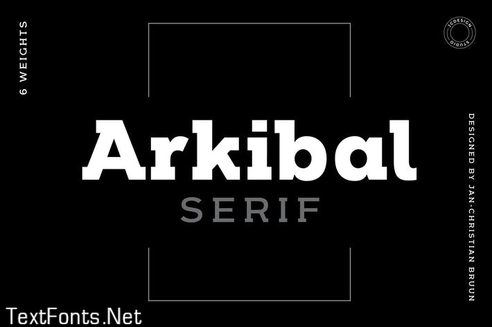
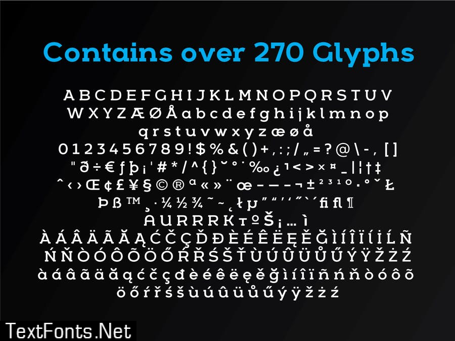
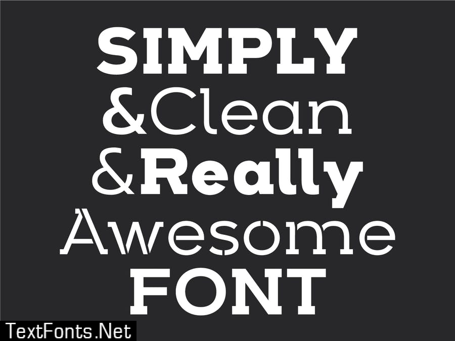
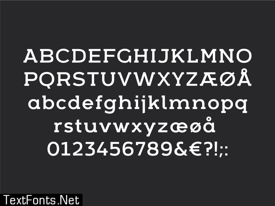

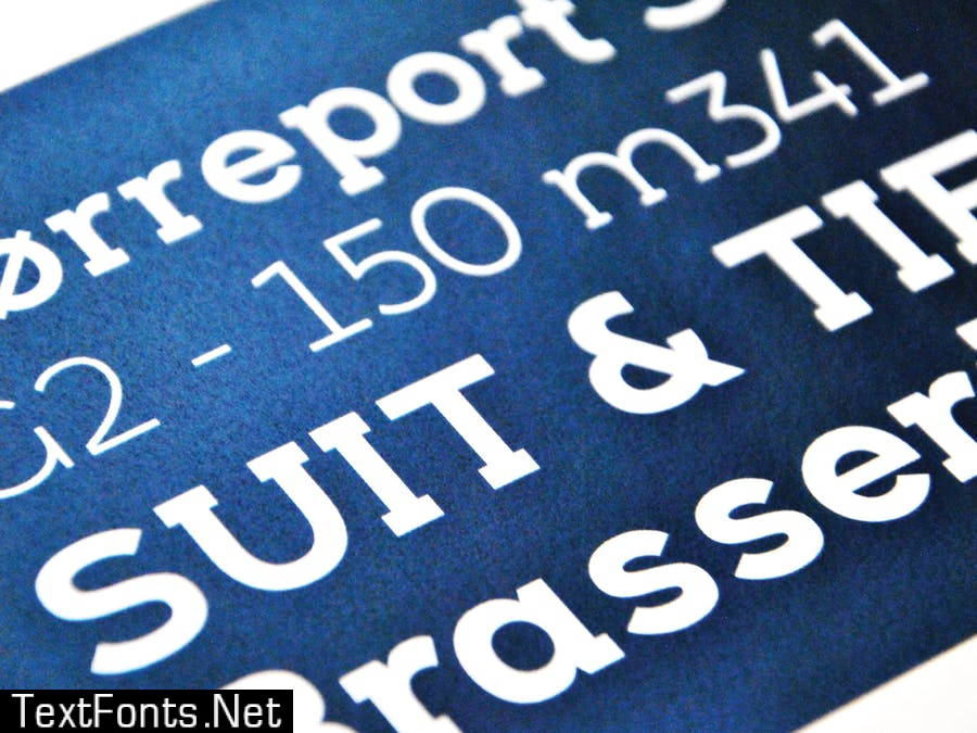
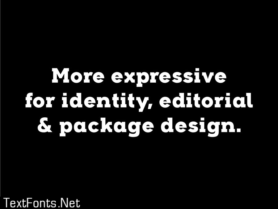
Arkibal Serif: a modern serif typeface created by Jan-Christian Bruun Arkibal is a typeface with 6 stylistic: sans stencil Designer: Jan-Christian Bruun Date: 2015 Style: Thin, Light, Medium, Regular, Bold, Heavy Format: OTF, .TTF, .WOF/.WOF2, .EOT-formats
