A man far cleverer than me once said that we strive for excellence when mediocrity will do.
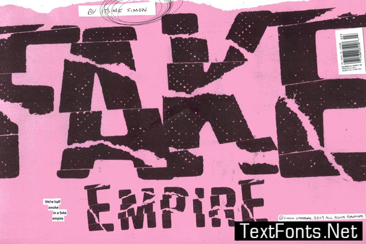
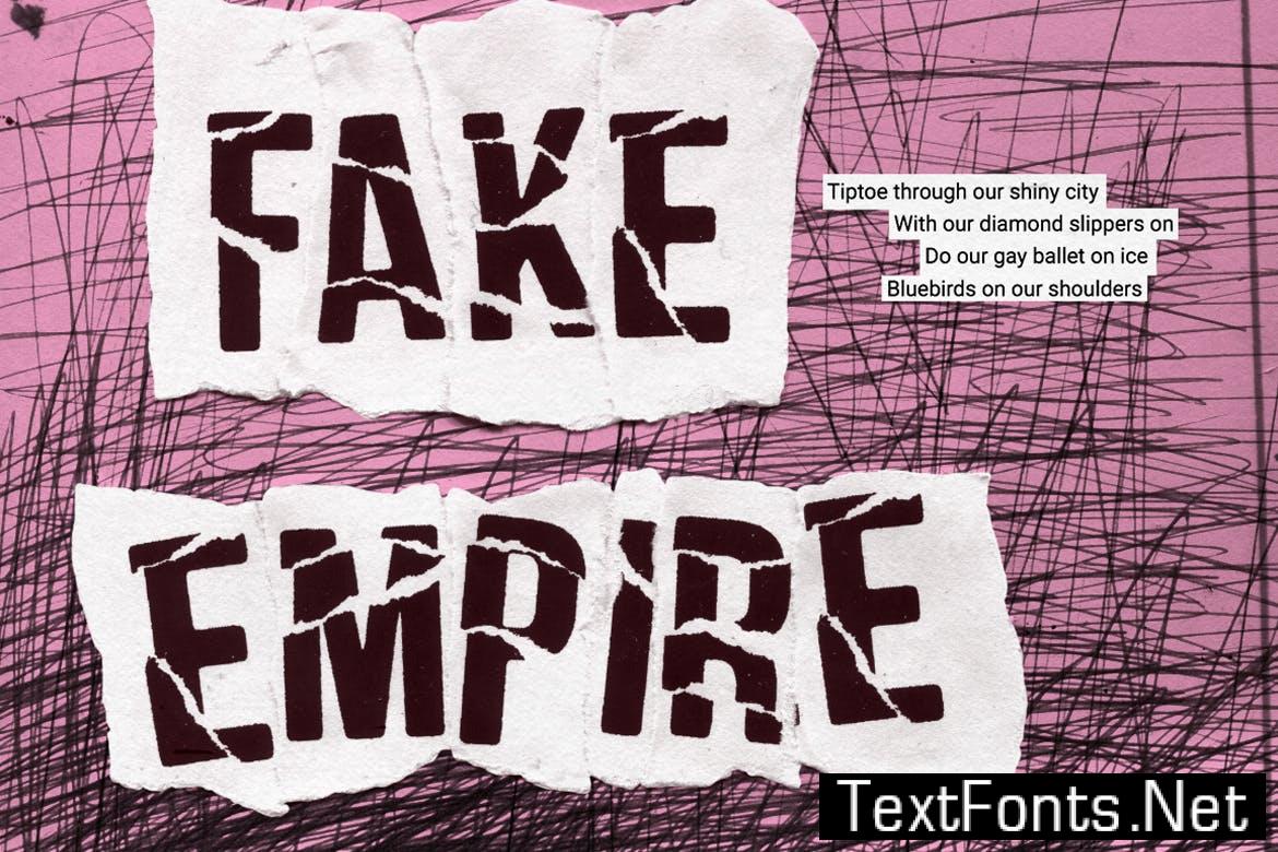
That pretty much sums up my new font called Fake Empire.
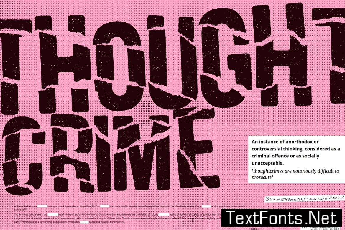
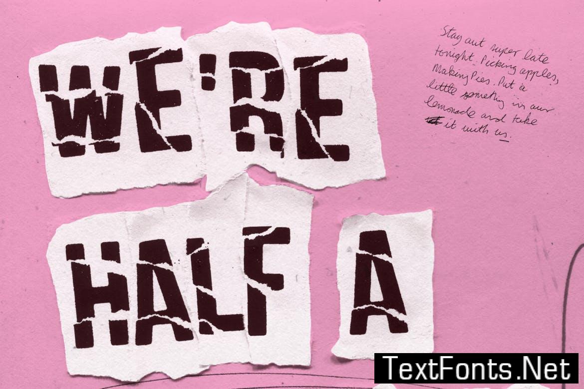
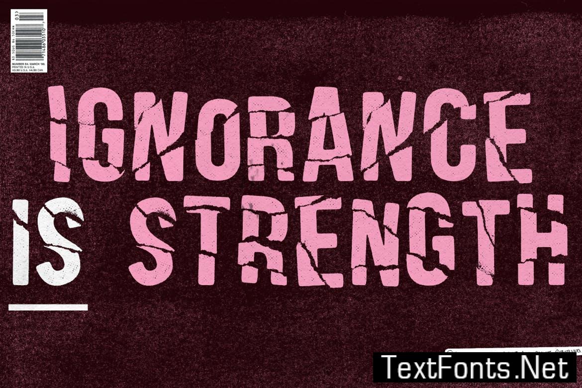
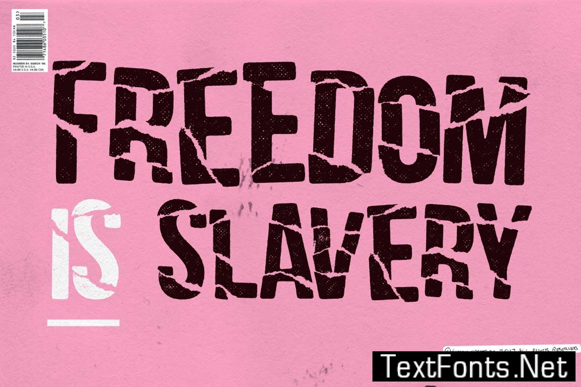
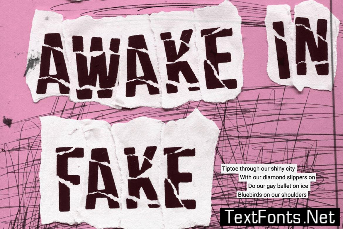
Using nothing more than paper, glue and scissors, I’ve stripped it back to the basics—getting my hands dirty in the process.
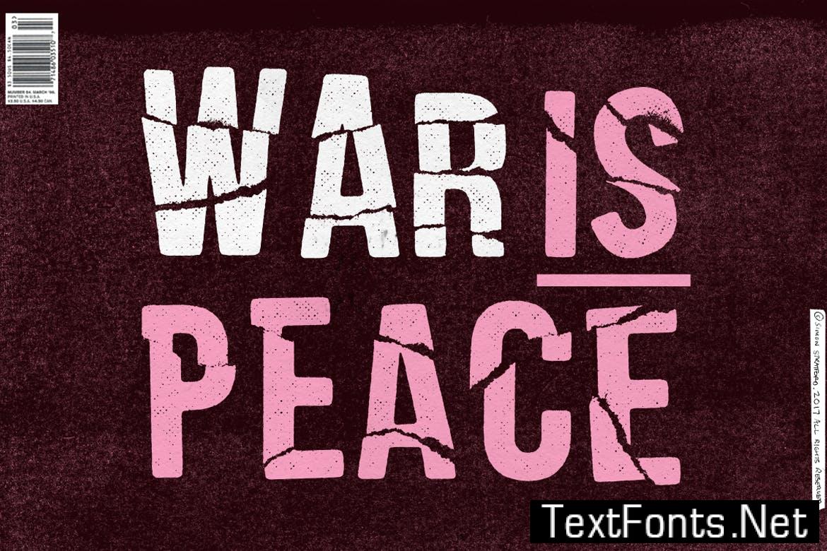
Fake Empire is not perfect. It’s faulty, flawed and defective. It celebrates the fact that its crude, dirty and damaged goods.
The font is highly detailed and is best suited for headlines and display.
The font format is .OTF
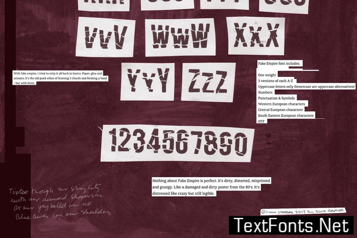
Fake Empire font includes;
* One weight
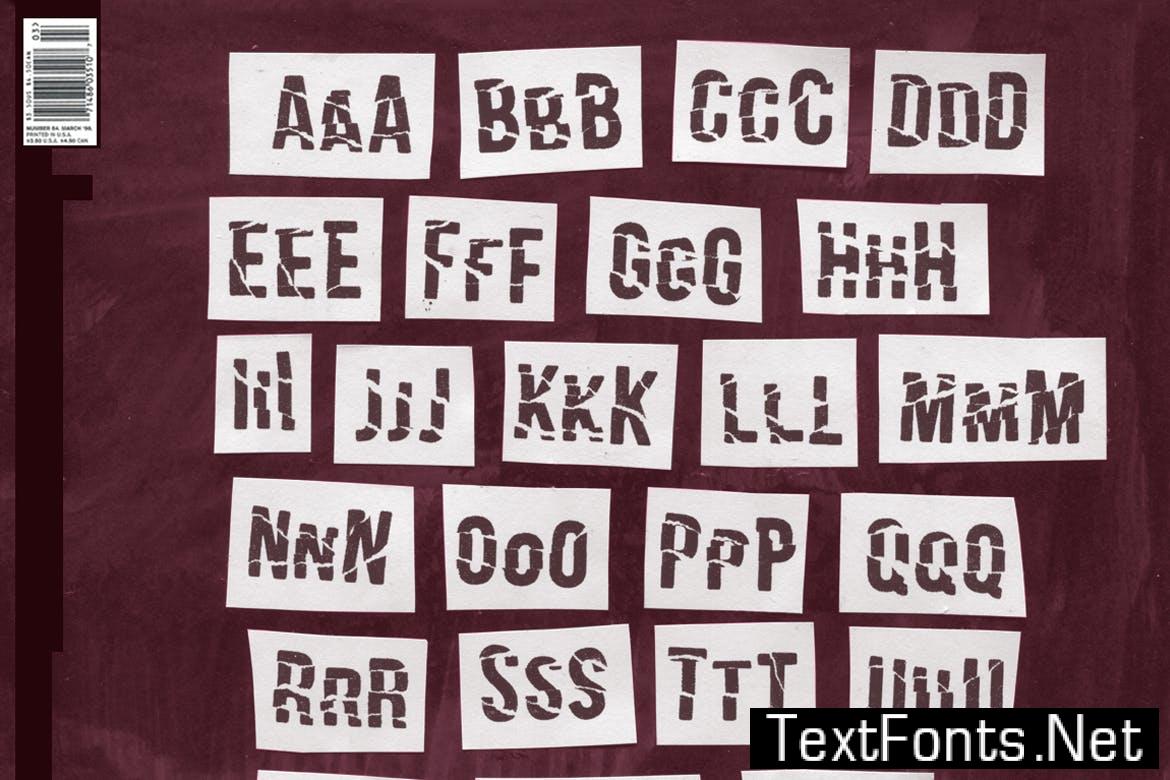
* 3 versions of each A-Z
* Uppercase letters only
* Numbers
* Punctuation & Symbols
* Western European characters
* Central European characters
* South Eastern European characters
* Font format is .OTF
 spacing: Normal
serifSansSerif: Sans-Serif
optimumSize: Large (Display / Poster)
Additions: isWebfont, hasDocumentation,