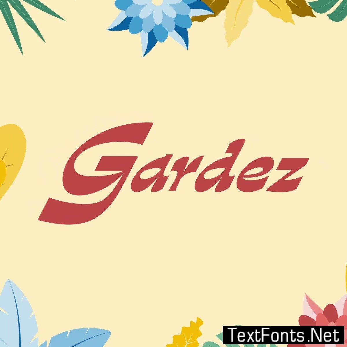
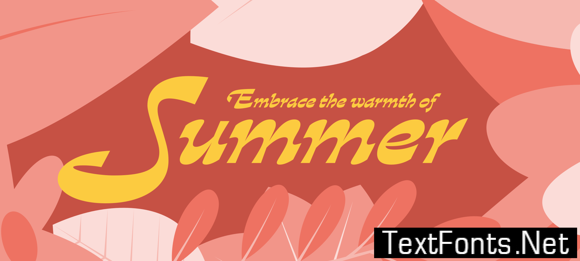
Gardez is an eye-catching display typeface, designed for use at large sizes and in short passages of text. Its highly-expressive features make it an ideal choice for packaging, logotypes, posters, magazine titling, and book covers.



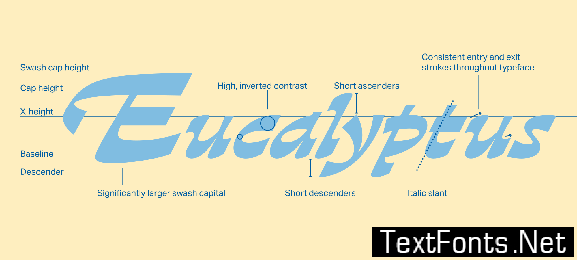
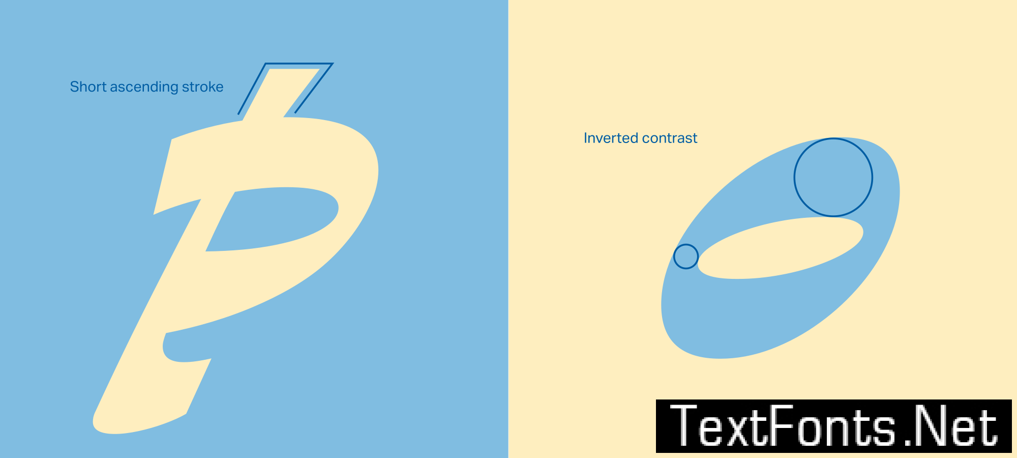
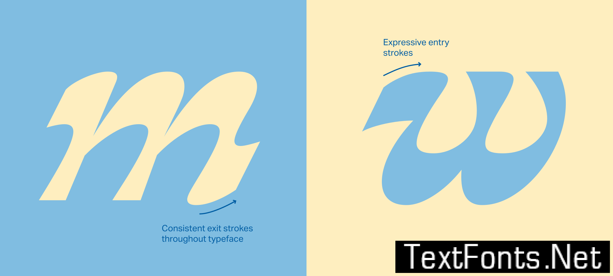
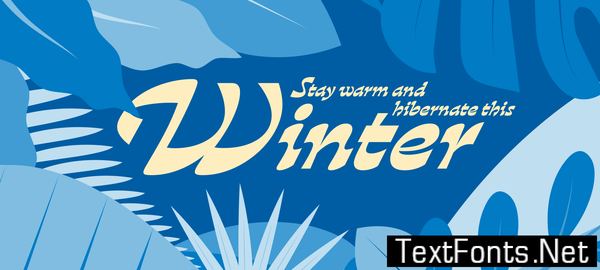
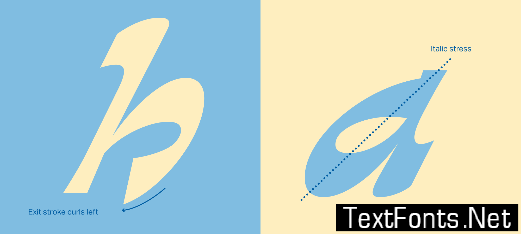
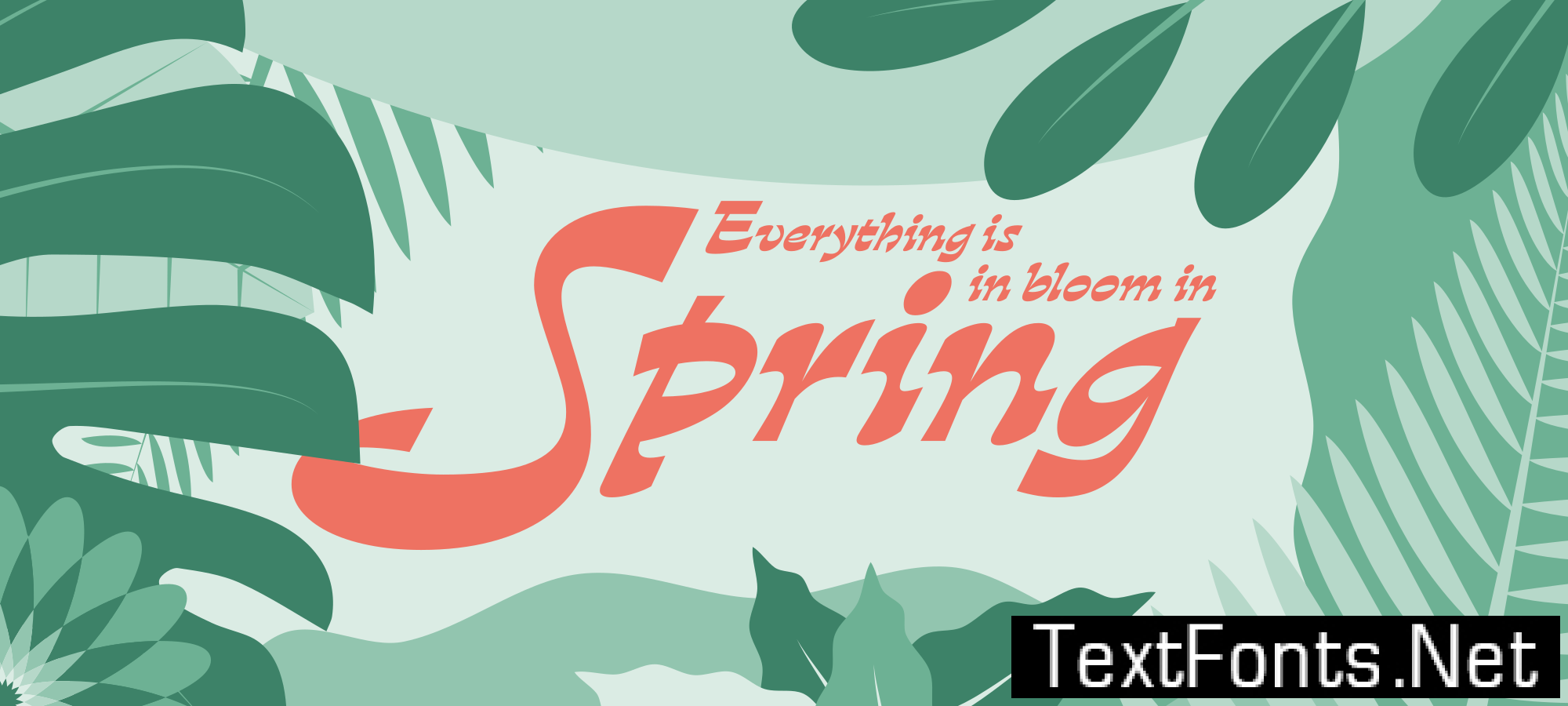


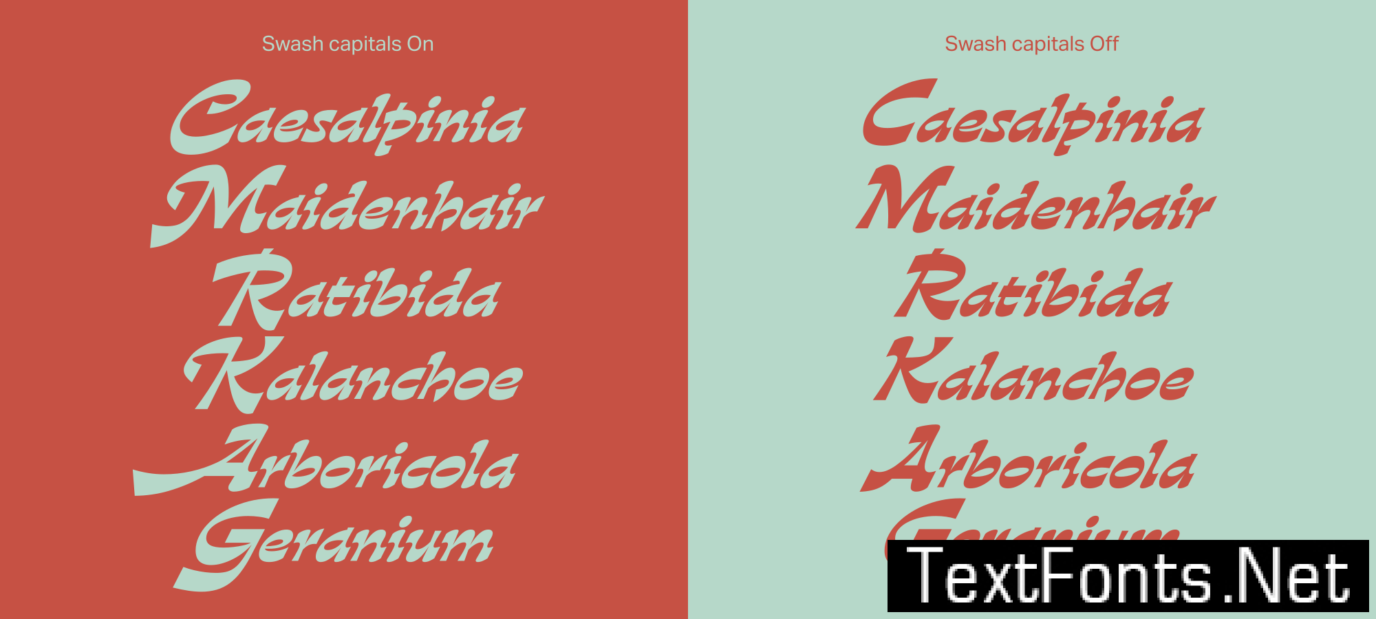
Gardez was born from the merging of the typical forms and features of traditional garalde italics with those of an inverted contrast design – two styles that are traditionally very far apart. In contemporary design, visual taboos are falling and there is an insatiable appetite for unorthodox and challenging designs; we saw an opportunity to be brave and irreverent by combining two extremes into something very new and very different.
Dalton Maag Designer Rafael Saraiva developed a unique and perfectly-executed display typeface that captures the reader’s attention and remains with them. Gardez takes liberties that only digital display typefaces can: extremely large capitals, unapologetic swashes, and fluid, expressive strokes that purposefully defy the laws of legibility.