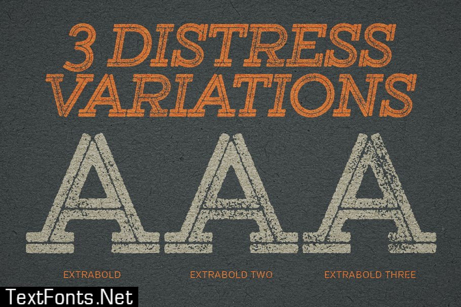
Gist Rough is the letterpress version of Gist from Yellow Design Studio. It\’s warm and weathered with a retro yet modern vibe. Every weight includes 3 versions with varying levels of texture which can be used individually or mixed to taste. It has highly detailed texture and looks great even at large sizes.
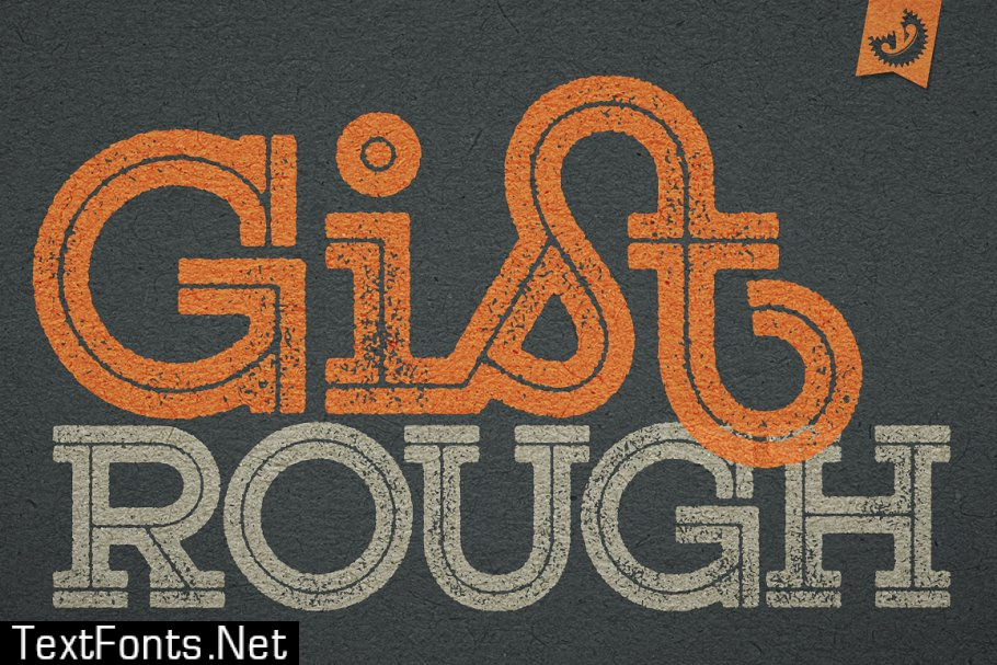
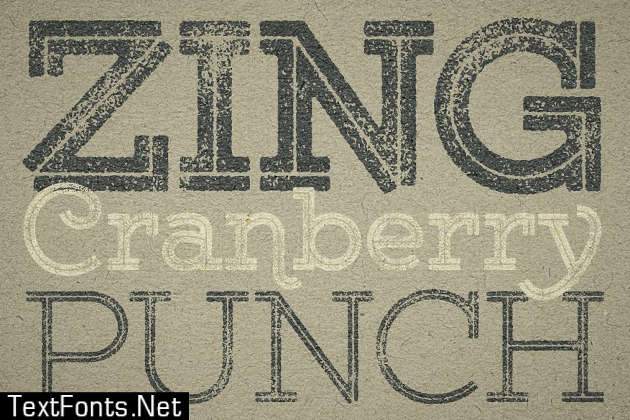
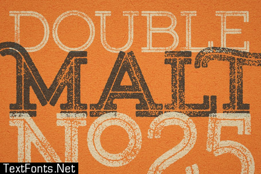
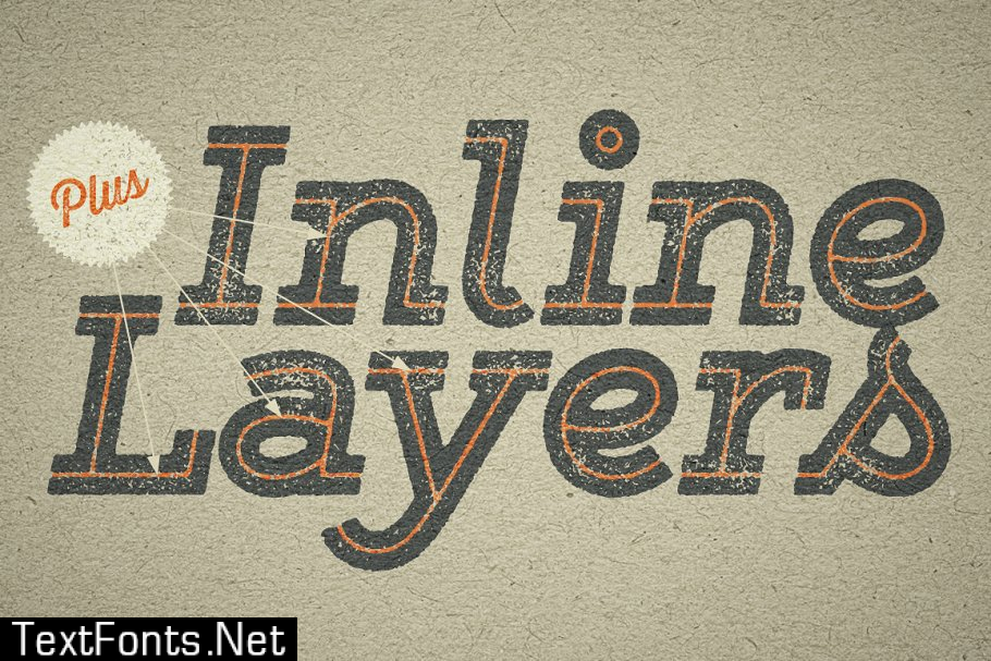
With 627 glyphs per weight, Gist Rough is highly customizable…either keep it simple with the base character set or use ligatures, alternates and swashes for extra flair. All-caps typesettings have an especially retro edge. Also included are line layers for adding color to the inline areas.
Gist has both Upright and Regular (italic) versions. It includes a complete set of funky contextual alternate caps plus some schmancy lowercase variations. Most caps have additional swash versions as well. A bunch of other capital and lowercase alternates are thrown in for an especially pleasurable typesetting experience.
Because of its complex outlines, Gist Rough may process slowly in some applications.
Opentype Feature Descriptions: Ligatures – Enables the standard ligatures that fix overlapping letters Discretionary Ligatures – Enables the funkier ligatures Contextual Alternates – Enables the alternate caps and q, v, w, x, y, z alternates Swash – Enables the swash caps Stylistic Alternates – Enables the funkier h, k, m, n, v, w, y, z Stylistic Set 1 (Same as Stylistic Alternates) – Enables the funkier h, k, m, n, v, w, y, z Stylistic Set 2 – Enables the end-of-word alternates (terminal forms) Stylistic Set 3 – Enables the alternate round lowercase a Stylistic Set 4 – Enables additional alternate B, D, E, H, M, N, R,T, W, Z, &, d Stylistic Set 5 – Enables additional alternate E, H, M, N, R, Z, d Stylistic Set 6 – Enables additional alternate H, M, N Stylistic Set 7 – Enables additional alternate l, t Stylistic Set 8 – Enables additional alternate l, t Stylistic Set 9 – Enables additional alternate l, t Superscript – Enables the superscript characters
Gist Tips:
- In Photoshop try different \’anti-aliasing\’ settings for best results.
- In Illustrator if the line layers don\’t align with the normal layers, change the “First Baseline” setting in the Area Type Options to “Leading”.
- Works best with opentype savvy application, especially those with a glyphs palette like InDesign, Illustrator and Quark. All glyphs can also be accessed in any layout software by using the application “PopChar” by Ergonis.
