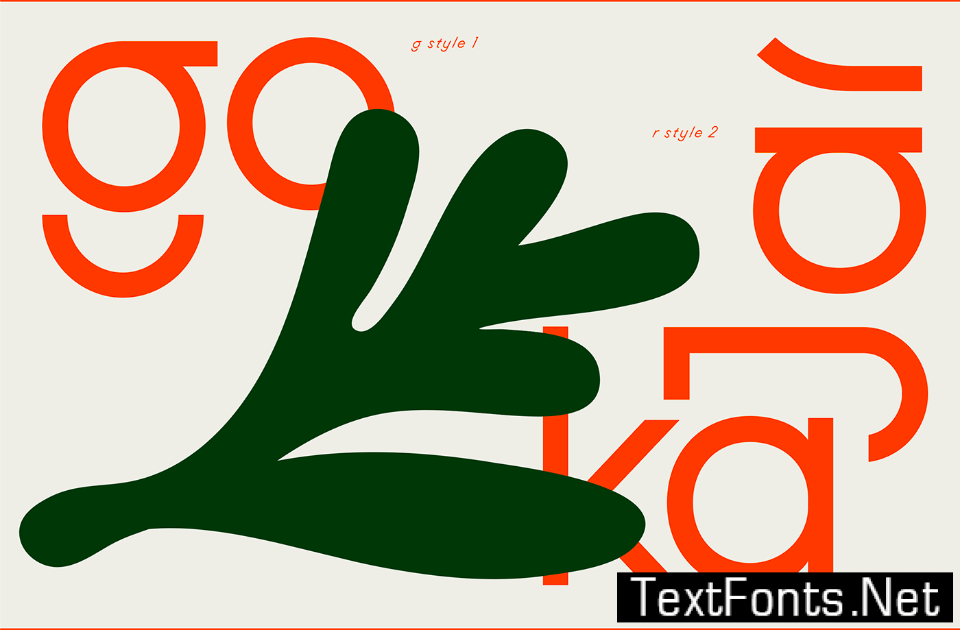
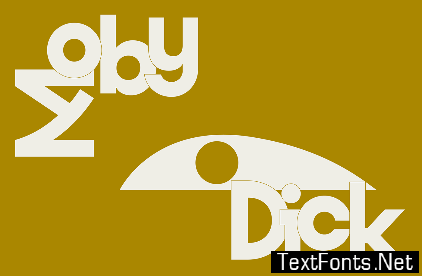
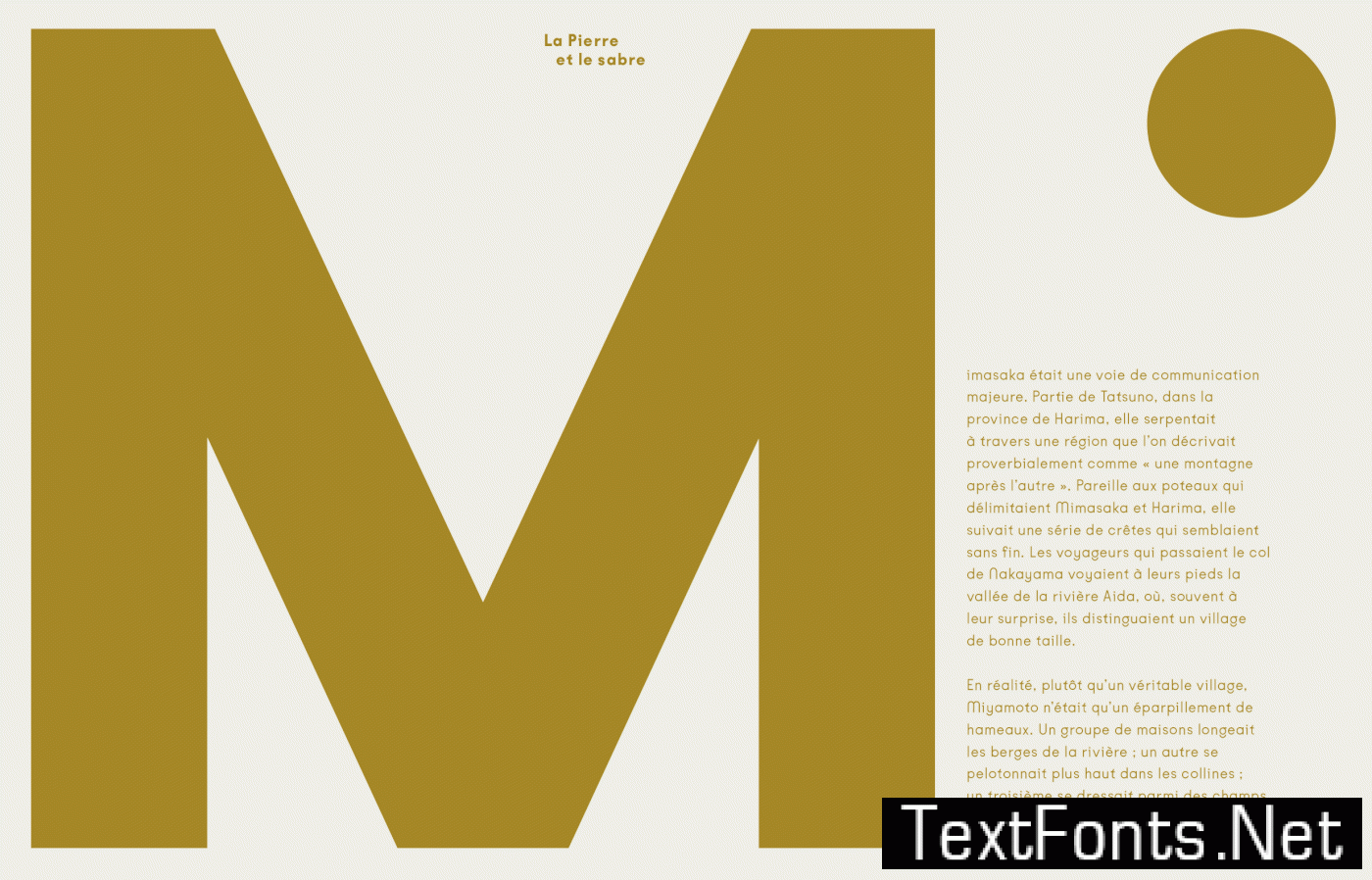
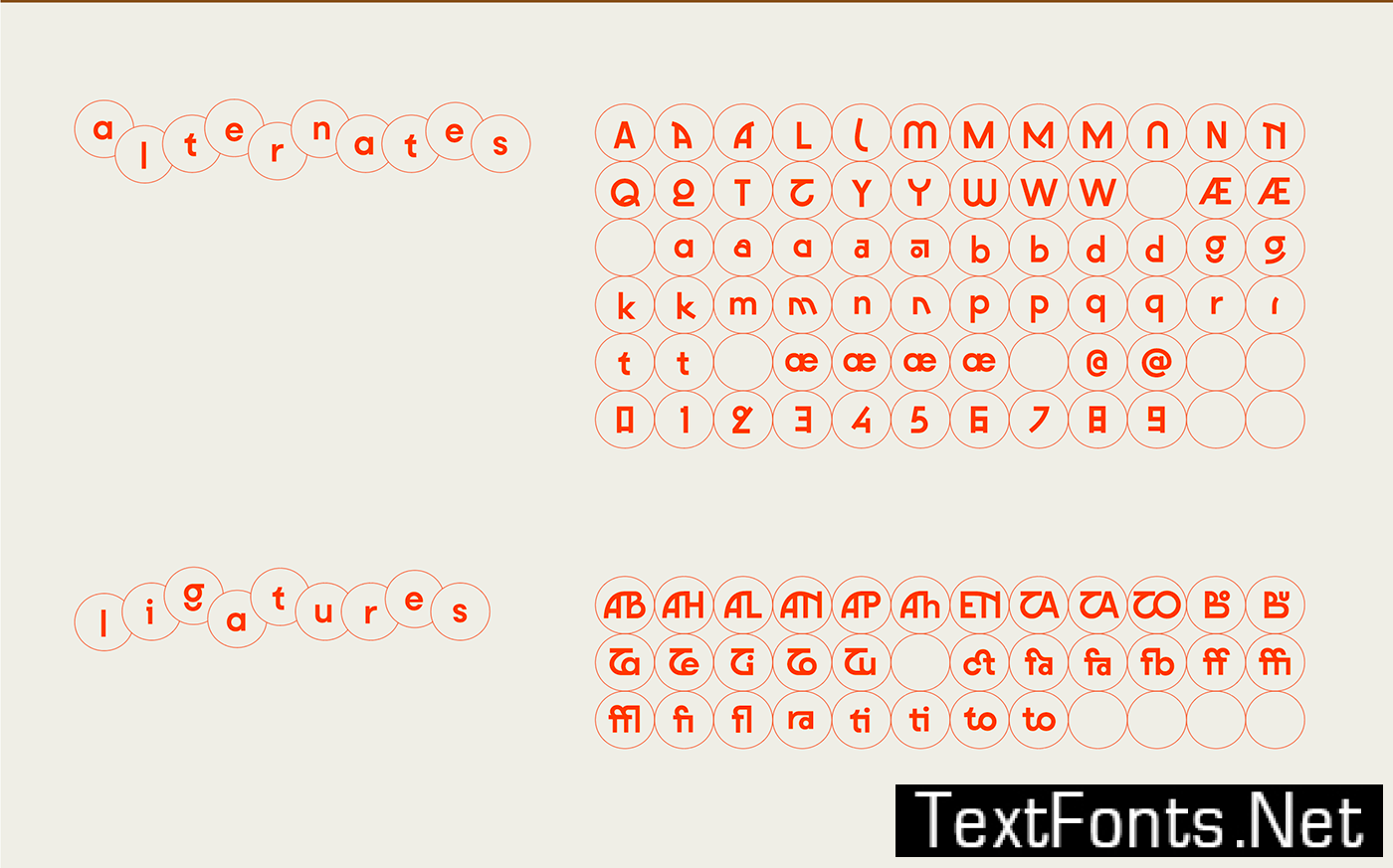
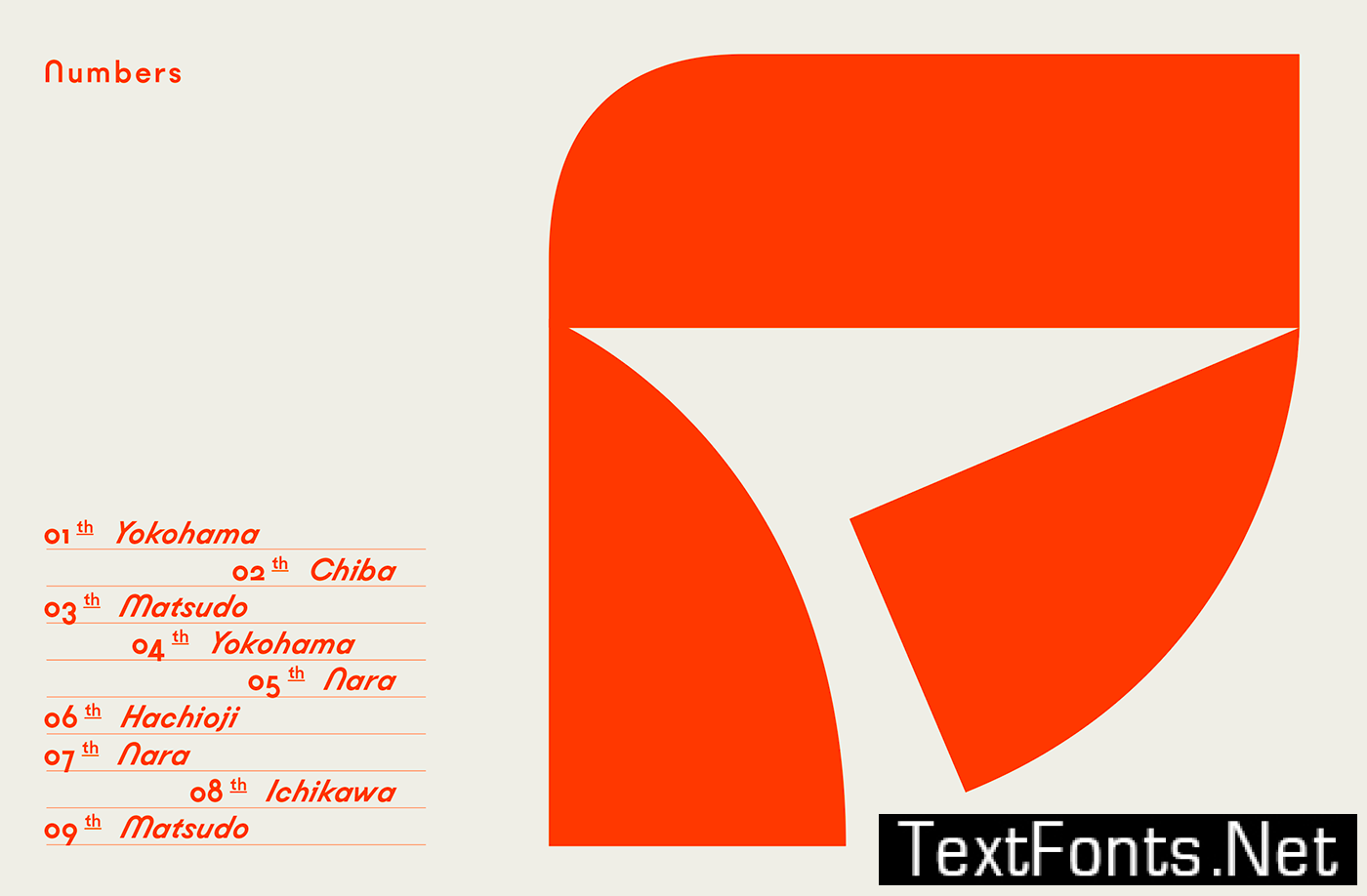
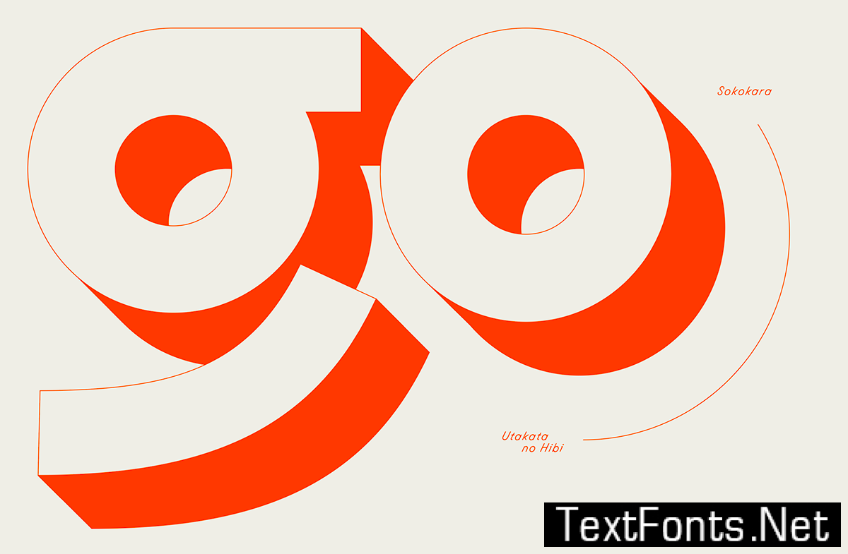
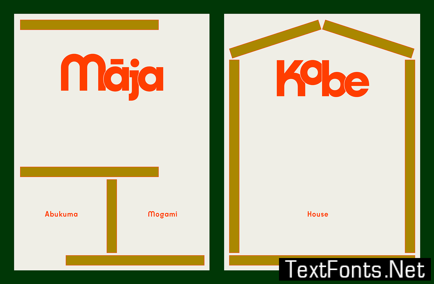
Kobe is our new classic. First released as a one-weight font in 2018, it quickly became a house favorite : its straight-forward, well-proportioned modular structure made it as usable in text as its playful terminals and many alternates made it fit for display versions. Kobe is versatile yet timeless, which is why it defines the studio so well and is often present in our communication. The numerous ligatures and stylistic sets take inspiration from Japanese writing shapes. The regular version has just undergone a subtle makeover and now exists in 5 additional weights, perfect for text. The daring slant of its oblique makes the letters stand out in large paragraphs and is a clear testimony of our studio’s quirky approach at designing fonts.


