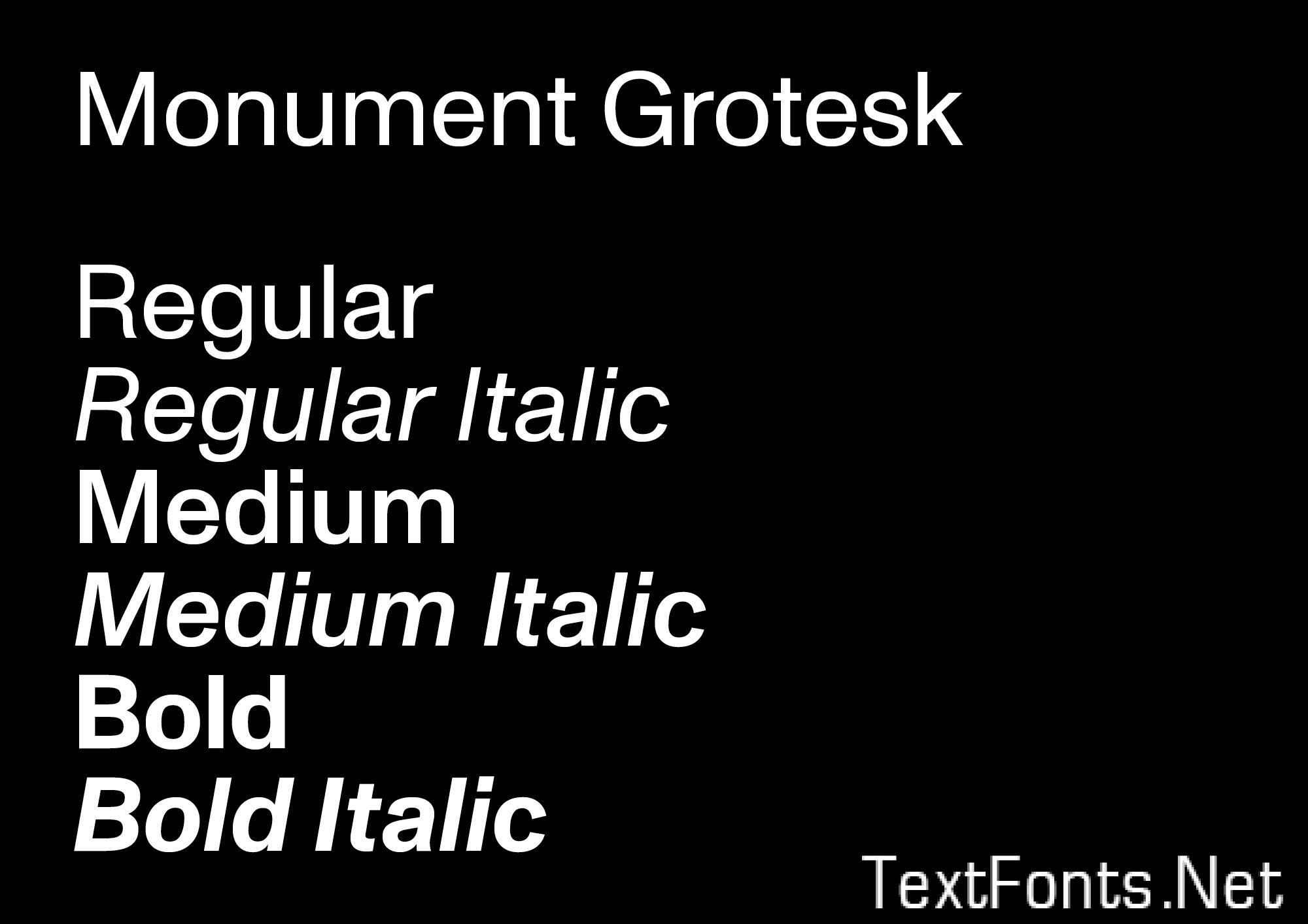
Monument Grotesk owes its point de départ to a few contours Kasper-Florio stumbled upon online in 2013 in Palmer & Rey’s New Specimen Book, 1884, on page 81. It relied on a sturdy and compact skeleton, high vertical contrast and surprisingly sharp end strokes. The “o” “c” and “e”, with their squarish inner counters pressing against their outer parts, or the elongated “r”, in particular, gave reason for a couple of screenshots, and later, a digitisation.

Since founding their studio in 2013, Kasper-Florio have masterfully worked on commissions from the Swiss cultural design landscape and been awarded the prestigious Most Beautiful Swiss Books prize in 2013, 2016 and 2017. Their output is conceptually to the point, awfully consistent and print-fetishistic – with Monument Grotesk serving as their house typeface almost exclusively.
Always challenging their commissions and respective reproduction techniques, the typeface design has been revised to meet Kasper-Florio’s expectations in Screen Printing (Helmhaus Zurich, 2014), as Foil Embossing (Missue, 2014), as Digital Print on textile (Solarnet, 2015), in Offset Printing (Werkschau Thurgau, 2016 or Swiss Poster Festival Weltformat, 2017) and on Screen (PIN Systems, 2018).
Monument Grotesk carries the chronology of its development within itself: two characteristic stages of the “r”-glyph, “r.2” (2015) and “r.1” (2014), have been re-introduced to the character set – allowing you to travel back in time by using the typeface’s OpenType features.
Having proven its versatility already, Monument Grotesk was released first in one weight only and subsequently extended into a full family of three weights and corresponding Italics during summer 2018.
