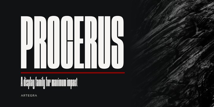
Procerus was designed to achieve maximum impact on a narrow ground with ultra compressed letterforms. The idea was to explore the beauty in perfectly integrated straight shapes to maximize the use of space while keeping the empty space to a minimum. The result was a stunning display family that makes the type interesting, engaging while still being readable.

There are 18 fonts in the family, ranging from Thin to Black weights along with their italic counterparts. 391 glyphs allows a good amount of multilingual support. Procerus was mainly designed for poster design, packaging design, book covers and advertisement, but it works great for titles, headlines and logo design as well.
