The first iteration of RM was released in 2011, followed by RM Pro in 2016. RM Neue is a completely redrawn and redesigned adaptation of RM Pro, previously available in only three weights. Inspired by utilitarian neo-grotesques, RM Neue aims to be a timeless addition to each designer’s font repertoire and has been designed to be clean and legible at all sizes. RM Neue features compact proportions and a low-contrast design, which make it feel immediately familiar, yet not as sterile as would be expected for such a grotesque design. The ascenders in RM Neue have the same height as the caps. For this reason, the default “l” features a curly serif, which helps set it apart from the capital “I”.
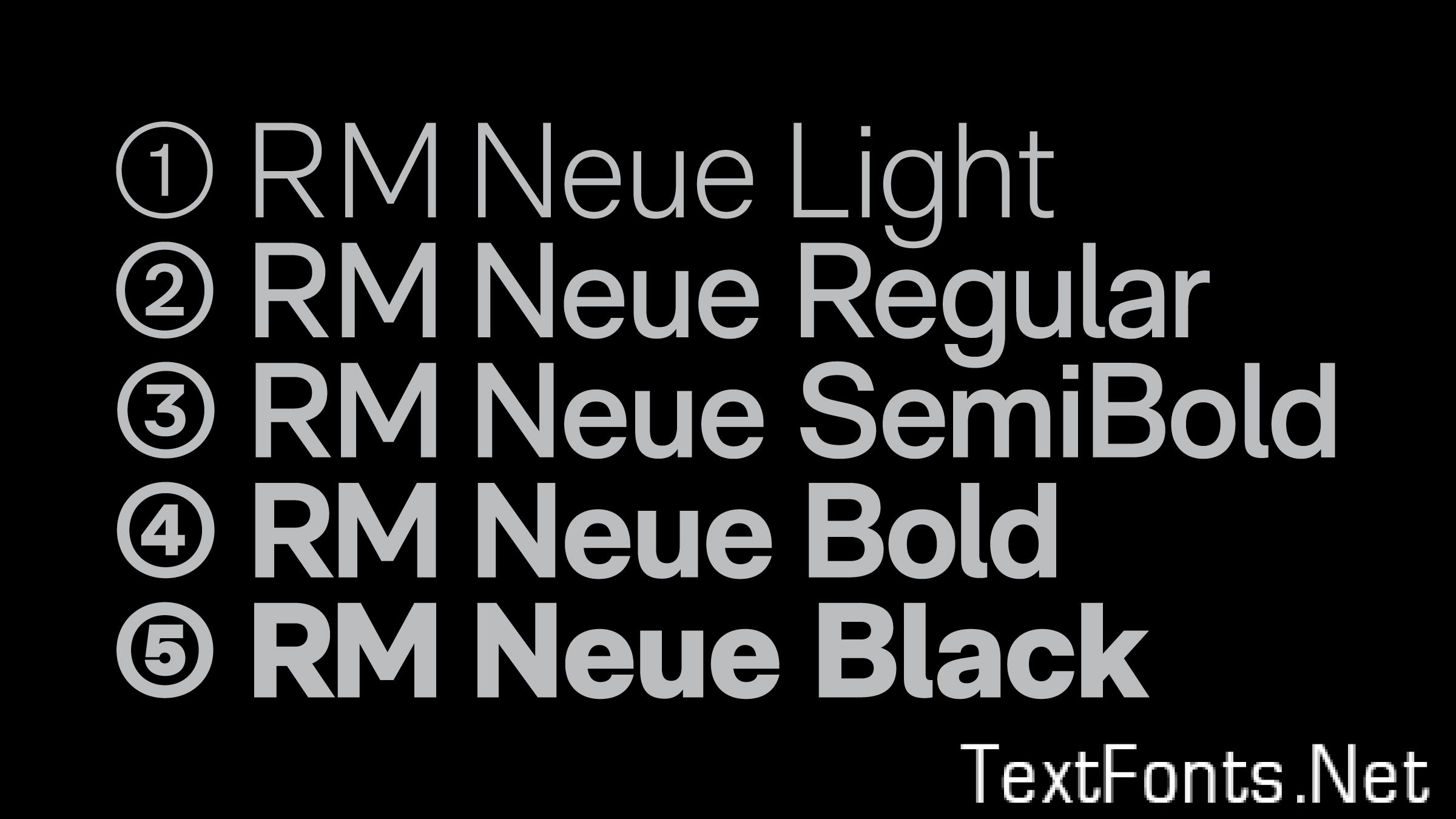
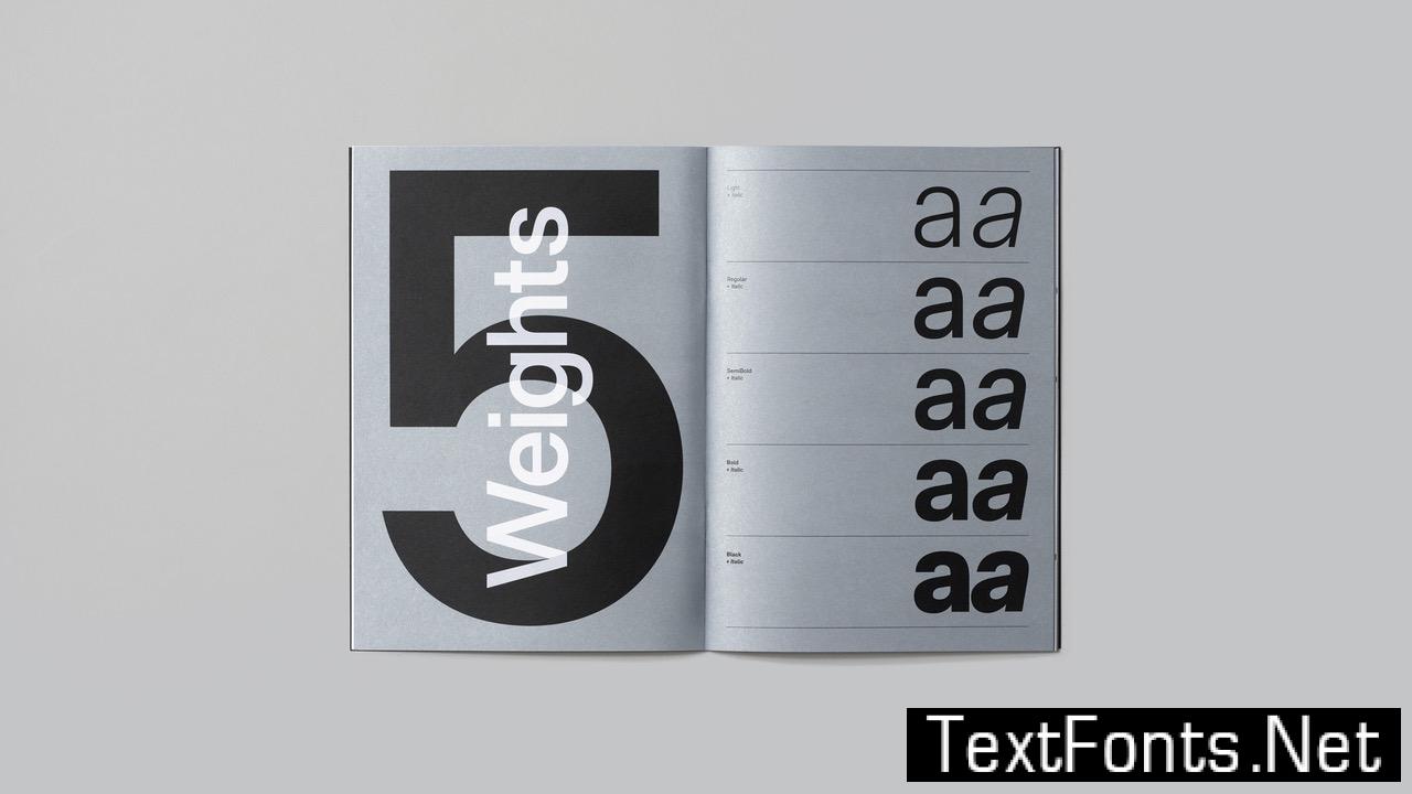
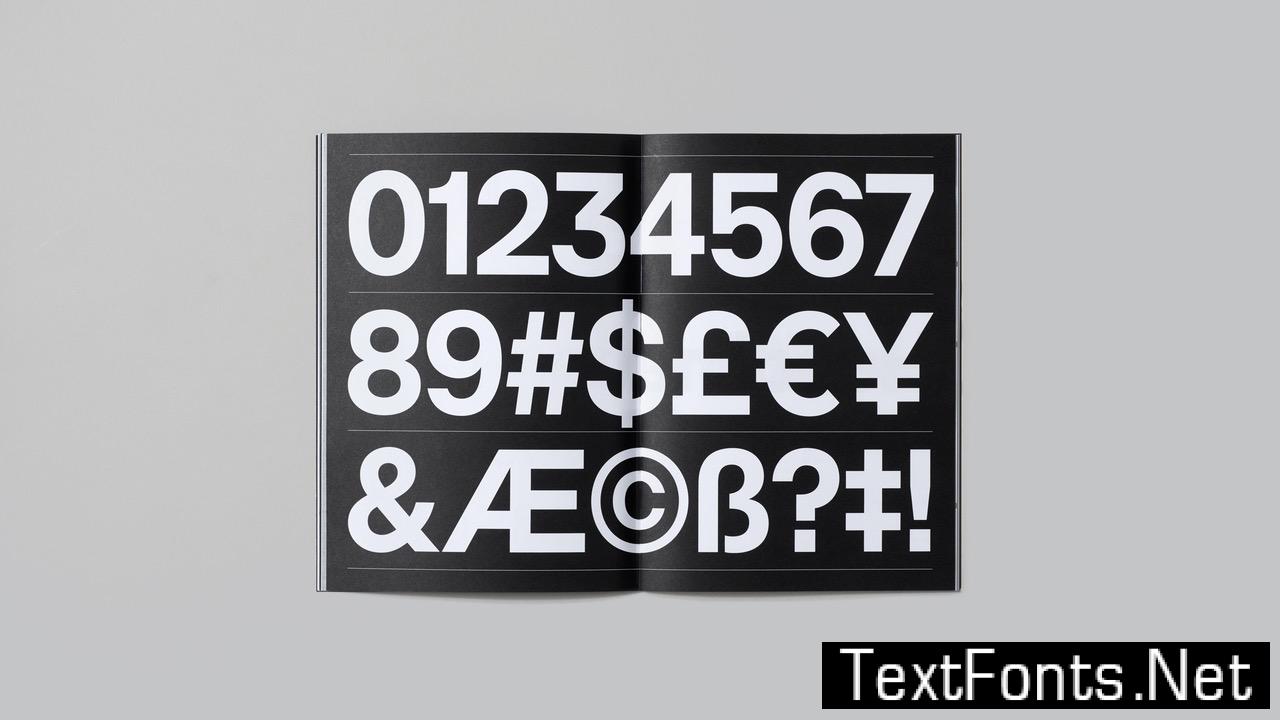

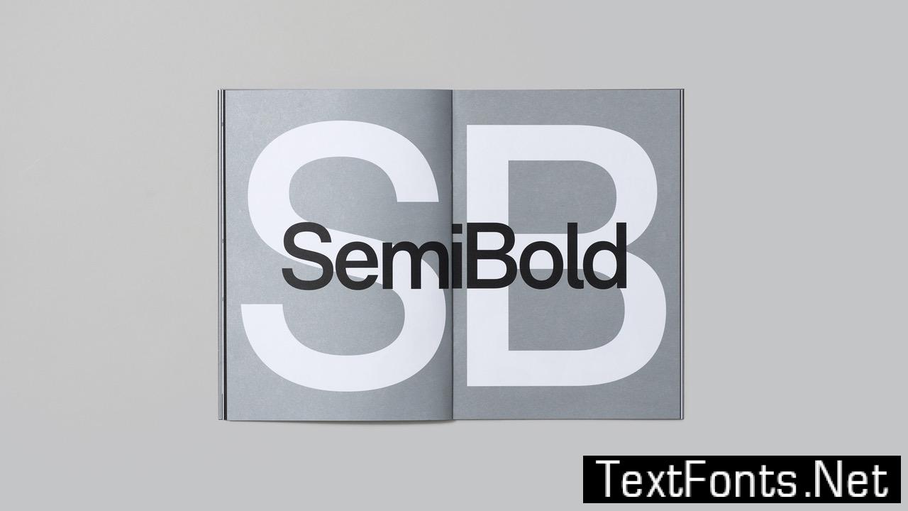

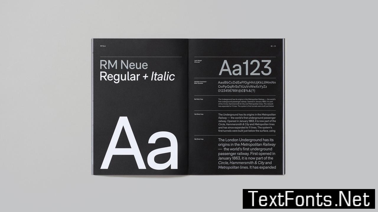
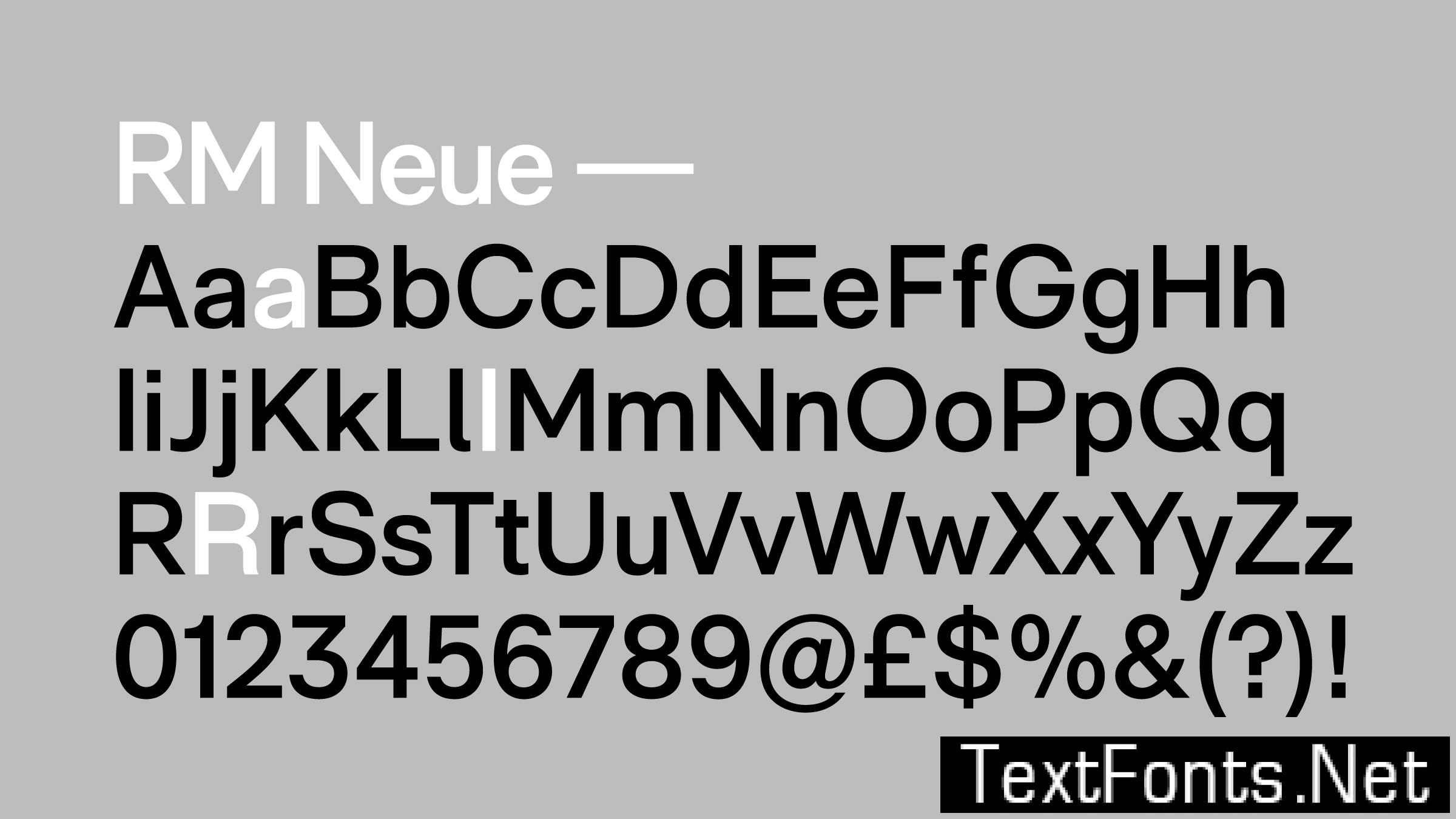
RM Neue is available in 5 weights: Light, Regular, SemiBold, Bold and Black, each with matching oblique italics. The character set spans the Latin Extended unicode range, covering most languages written with the Latin script.
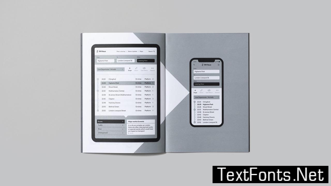
The Regular weight is slightly heavier than other grotesque families, which gives RM Neue more impact at larger text sizes (12–16 points) as often used on modern, minimal websites and in zines.
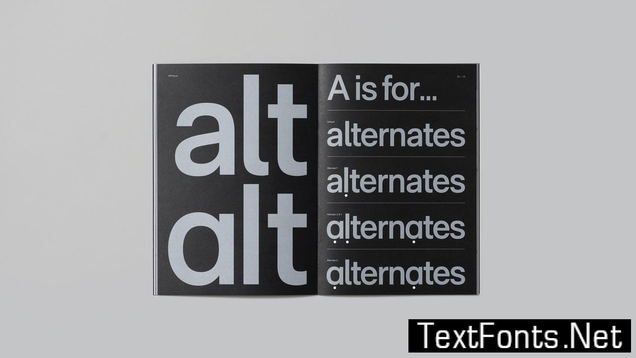
Via the OpenType features, the user can access an alternate single-storey ‘a’ and simple ‘l’, without a serif.
Visually striking at display sizes and highly legible as a text face, RM Neue is both distinctive and functional, making it the perfect choice for professionals seeking a versatile sans-serif for a range of design environments.