Roslindale gets its unique attitude from the reverberation of sharp, pointy serifs against bulbous, round shapes. In her interpretation of DJR’s design for the Cyrillic script, Serbia-based type designer Jovana Jocić has taken Roslindale’s interplay of sharps and rounds to the next level.
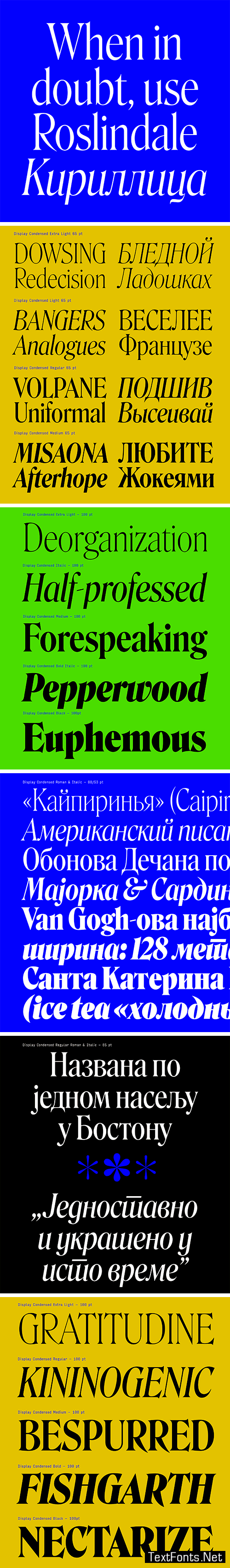
Roslindale builds on the model of De Vinne, a quirky oldstyle from 1892 named after the famed nineteenth-century printer. But while De Vinne was at times a bit blotchy and uneven, Roslindale’s tight spacing and slick curves lean more towards 1970s interpretations of the style.
Jocić stays true to this visual style and adapts it expertly to the Cyrillic script. From the spikes on the bottom of Д to the the curled ball terminals of й, she uses every opportunity to coax the tension out of these disparate shapes.
This expansion comes in upright and Italic styles, with Bulgarian and Serbian alternates. The family includes utilitarian styles for Text as well as Display Condensed styles that allow for more dramatic flourish.